
Fort Worth, Texas-based ![]() American Airlines
American Airlines
debuted its current livery more than a decade ago. The sleek design, which pays tribute to its former and iconic bare-metal scheme, primarily features two shades of gray, along with touches of red, white, and blue.
After American modernized its brand, other carriers, such as Alaska Airlines, Southwest Airlines, Frontier Airlines, and United Airlines, followed suit. Despite being the first, the ![]() oneworld Alliance
oneworld Alliance
airline has since made subtle changes to evolve its look.
The Flight Symbol
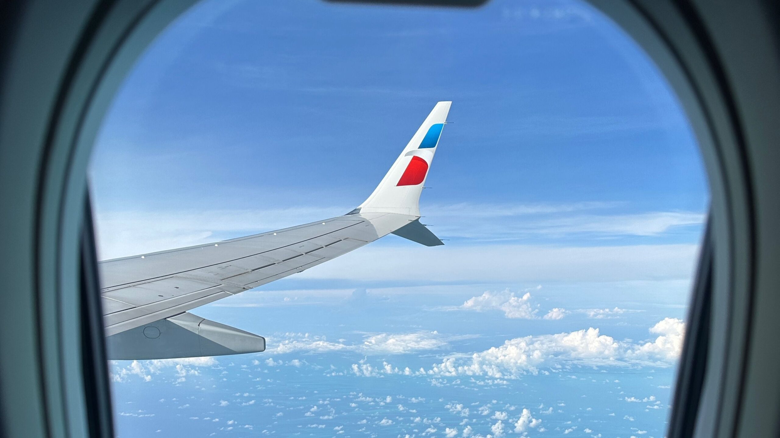
Plane spotters and aviation enthusiasts alike have noticed some of the minor updates American has implemented. However, not all aircraft have been updated. When it first debuted, the minimal look only had aspects of red, white, and blue on the tail and fuselage of its aircraft, with the rest of the plane painted in light gray or silver. While the design remains today, American has more recently been painting the winglets on select aircraft with its eagle emblem, known as the “Flight Symbol.”

Photo: Vincenzo Pace | Simple Flying
It is common for airlines to include its logo or an element of its livery on winglets as it enhances the aircraft’s look and provides a nice visual for passengers seated in window seats. In fact, every major US airline has some sort of paint scheme or popping color on the winglets of its aircraft.
American’s unique choice to keep them bare when it debuted its livery
sparked confusion, given that its former bare-metal look featured winglets painted with a strip of red, white, and blue beneath the letters “AA.com” advertising its website.

Photo: NYC Russ | Shutterstock
Southwest’s former canyon blue livery also had “Southwest.com” painted on the winglets of its aircraft; however, with its special-liveried state-tribute aircraft, the carrier interestingly leaves the winglets blank as well.
First unveiled three years ago
According to independent aviation blog Ishrion Aviation, American debuted its flight symbol on the winglets of a Boeing 737-800
, registered as N306NY, in October 2021 – about eight years after unveiling the new livery.
Simple Flying recently spoke to the carrier about why it ultimately introduced branded winglets. Brian Metham, a spokesperson for the airline, says the decision came down to the winglets’ size and passenger satisfaction.
“The winglets were a great canvas to add an additional branded touch to our planes, and beyond that, our customers love taking photos from the window while they’re in flight — and more specifically, photos with our wings in sight.”
Contrary to what some may believe, the flight symbol is indeed painted, not a decal. Metham explained that painting each winglet is a process of “several steps.” An outline of the flight symbol is first laid out, with the blue and red base colors applied afterward. Then, painters will carefully introduce the gradient, followed by white paint, and a clear coat.
“Dot mapping is placed on top, and the second set of blue and red colors are added to create the gradient seen on the tail and fuselage,” Metham explained. “Once these sections are dry, they are covered, and white paint is added. After that dries, a gray gradient is applied, followed by a clear coat.”

Photo: Channing Reid | Simple Flying
The process takes a few hours, but the paint will take a full day to dry completely. Metham said it is part of American’s regularly scheduled aircraft painting, meaning “it doesn’t add any extra time” or perhaps keep aircraft out of service longer than expected.
Changing the look
While slowly adding the flight symbol to the winglets
of its other 737-800s, American faced criticism for the look. Many onlookers explained that it was crooked or not aligned correctly.
“Is it me or does it seem very tacky? Like a boomer with no graphic design experience probably approved this lol,” one person said on a Reddit post last year.
“Ugly, crooked, asymmetric,” another commented. “I’d rather it just be left gray.”
Others sounded off in an Airliners.net forum when the look was first revealed.
“My main issue is that the angle of the winglet and the angle of the logo are different. It won’t look seamless, like it really belongs there. I’ll give them props for trying to depart from a boring gray winglet.”
American did not ignore what seemed to be disapproval from some people. Metham said hearing feedback prompted the carrier to change the positioning of the emblem.
“We listened to internal and external feedback regarding the Flight Symbol positioning and worked on a solution to increase alignment.”
Photos of two 737-800s taken this year show the revision, as the outer edge of the flight symbol is aligned with the edge of the winglet.


It also appears that when American introduced the change, it removed the flight symbol from the outer side of the winglets, as opposed to originally painting it on both sides. It is unclear exactly how many aircraft have received the new change.
Other subtle adjustments
The flight symbol is not just on 737-800 winglets. American has added it to newer 737 MAX 8s
and select sharklet-equipped Airbus A319s
, and A321s
. However, they are a rare find compared to the 737s.
A photo of a 737 MAX 8 taken last year depicts the aligned emblem.

Photo: Erika Cristina Manno | Shutterstock
“Our goal is always to present our Flight Symbol in the best possible manner and in a way that aligns with our branding strategy,” Methan said. “We have designed branded winglets for the different aircraft types in our fleet and assess their placement when the aircraft is repainted as part of our regular maintenance schedule.”
According to American, a commercial aircraft requires a paint job
every eight to 10 years.
The flight symbol has not been the only element added to some winglets. Some 737-800s have been spotted with a red stripe on the top of the outer side of the winglets, but it is not clear why. Some have speculated that it is a way for the airline to differentiate each aircraft, while others believe it may have been some sort of test before introducing the flight symbol.


Another small adjustment American has introduced since 2021 is its Silver Eagle paint – a mica-free color explicitly created for the carrier. The paint looks nearly identical to the original 2013 paint but is less expensive, lighter, more fuel efficient, and better for the environment, according to the airline.