Summary
- Brand management is crucial for Airbus to effectively compete with Boeing.
- Airbus uses a deep blue hue for its commercial aircraft logo, symbolizing knowledge, authority, and reliability.
- The company also has a unique font, conveying strength and enhancing recognition for its corporate offerings.
Aviation industry enthusiasts know the European consortium, Airbus, and its American rival, Boeing, as the titans of passenger jetliner manufacturing. Airbus was founded over 50 years ago through a partnership of European aeronautics companies to compete with American manufacturers like Boeing and McDonnell Douglas. The firm made its mark on the industry by developing the Airbus A300, the first widebody, twin-engine passenger jetliner.
Brand management is critical for Airbus to compete with Boeing effectively, including all public-facing materials. We recently provided an overview of how Airbus’ logo has evolved over the years. Now, let’s review the logo’s meaning regarding the Airbus brand.
Evocative use of color
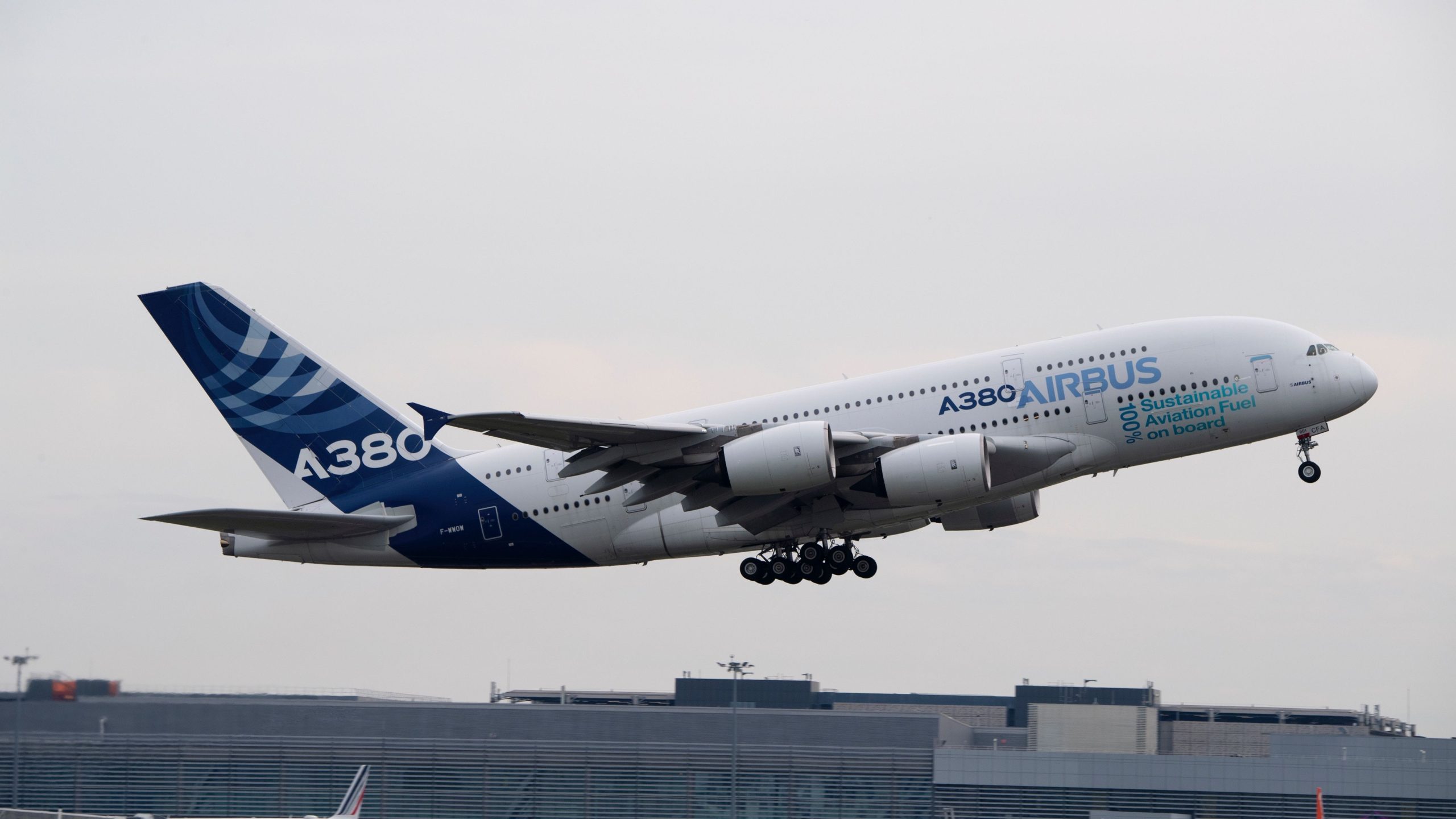
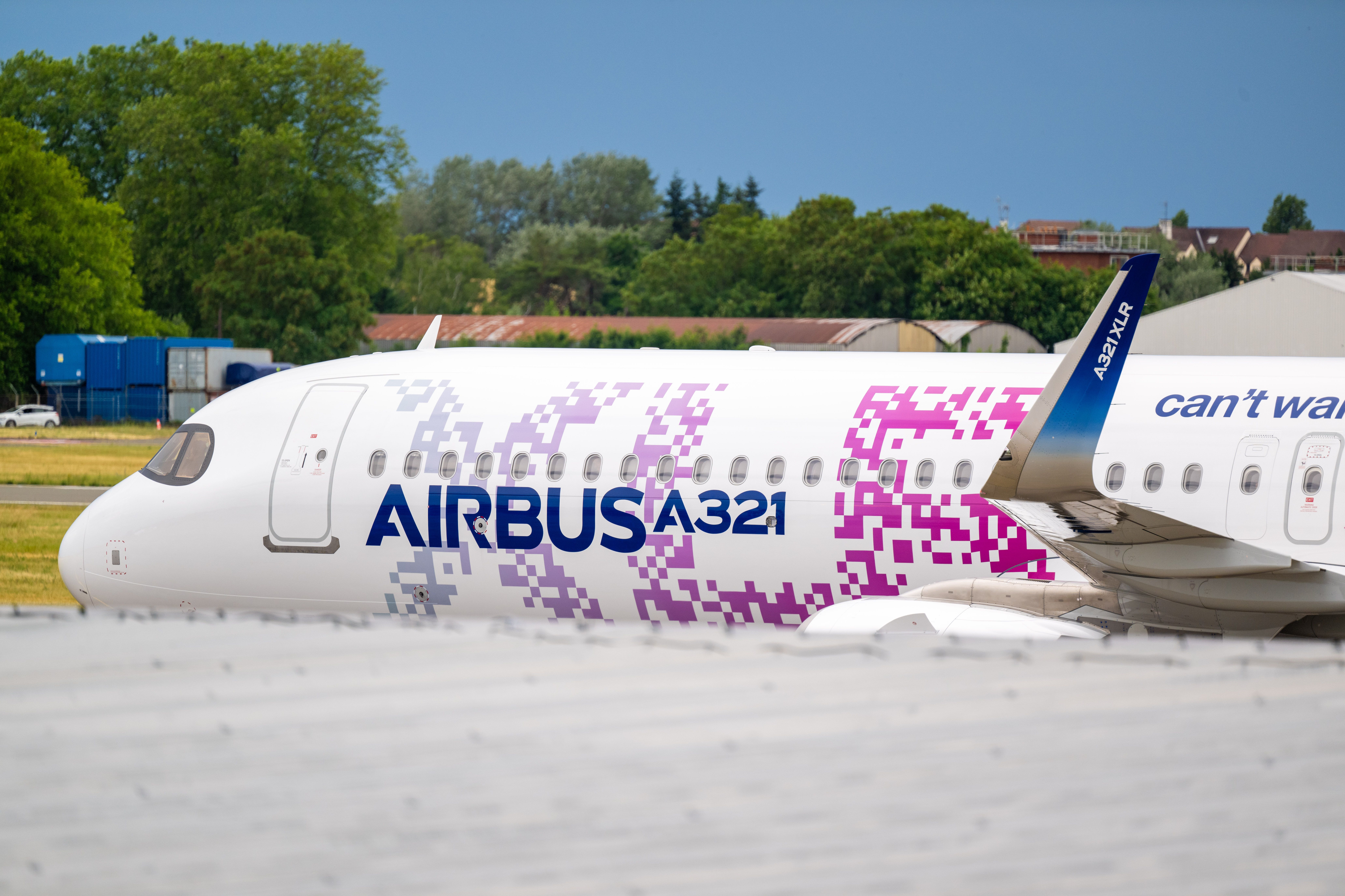
Airbus primarily utilizes two color schemes—one for its commercial aircraft and the other for its corporate-serving line of business. In the early 2000s, the firm began using a deep blue hue, Pantone 281 C, for its civil aviation logo, which consisted of the Airbus name complemented by a circle with converging swooshes, also in deep blue. The current Airbus logo was rolled out in 2017, which nixed the circle shape.
Photo: Airbus
In graphic design, this tone can convey traits of knowledge, authority, and reliability. Of course, it also evokes the sky and ocean, making it an intuitive choice for an aerospace manufacturer. While Airbus also provides black and white variants of its logo, the firm emphasizes that the blue variant shall be prioritized whenever possible on its website.
Photo: Airbus
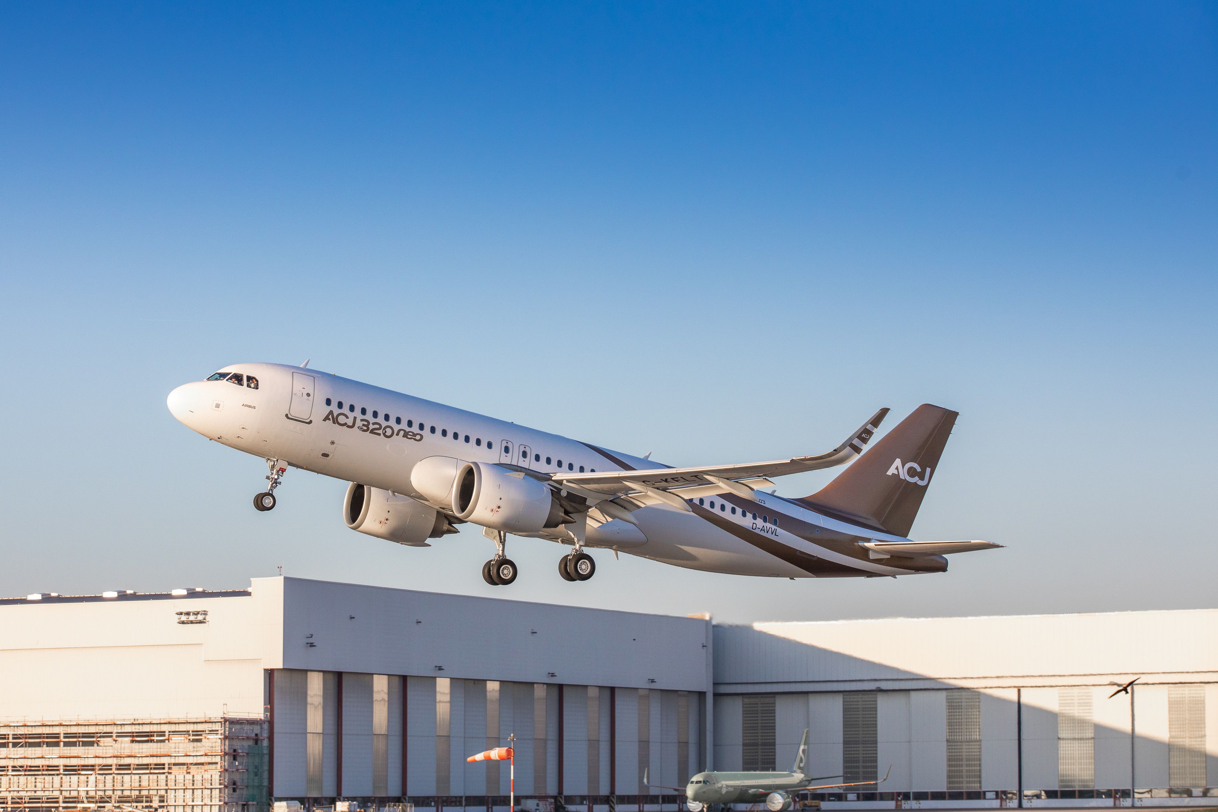
For its corporate jets and some helicopter offerings, Airbus chose a copper color version of its logo, Pantone metallic 875 C. The company decided to set this aspect of its portfolio apart from its jetliner line of business to enhance recognition and association with Airbus Corporate Jets/Corporate Helicopters. From a design standpoint, the color copper can be indicative of wealth, fitting for corporate clients.
A unique font
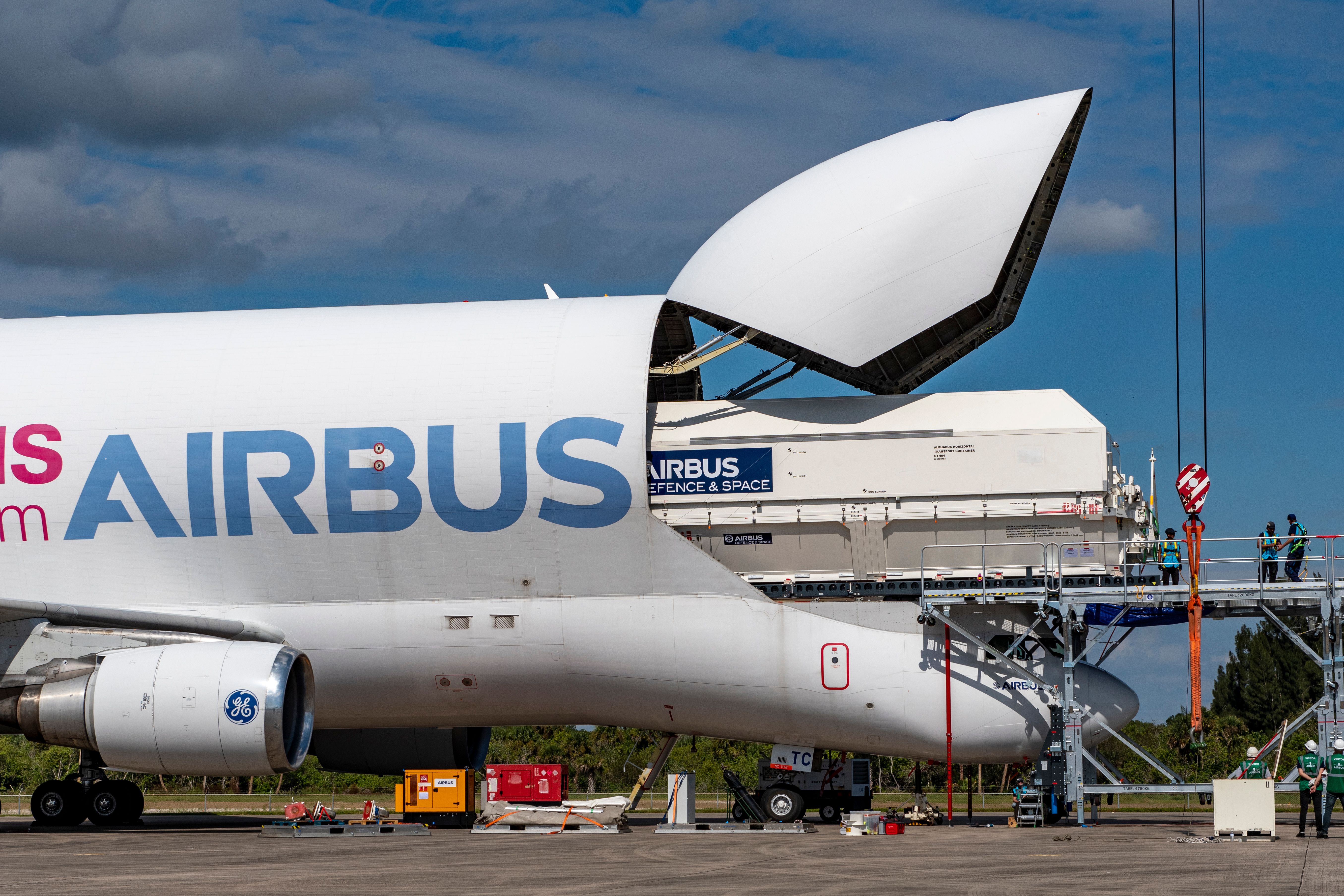
Like its color choices, Airbus also made deliberate choices in designating fonts to represent the brand. The company’s corporate typeface is Helvetica Neue LT, used for all corporate and marketing publications. However, the current Airbus logo is conveyed in a bespoke typeface designed specifically for the company.
Photo: Airbus
The most recent logo update that removed the circular symbol moved toward a more substantial verbal inscription that simply reads, “Airbus.” The standalone name warranted a bolder font, made more prominent by the saturated deep blue color. The significant characters in the Airbus custom typeface are distinct from one another via gaps between the letters, evoking strength.
Airbus fans may also be familiar with the company’s font research effort, which resulted in the B612 aeronautical font. In 2010, Airbus embarked on a project with Ecole Nationale de l’Aviation Civile and Universite de Toulouse to develop a font designed to improve the readability of the information provided on cockpit screens. After the preliminary research was complete, Airbus enlisted the help of a design firm to create eight variants of the new font. The company deployed the B612 font in its research simulators, which became widely available on Google Fonts.
Source: Airbus

