
Frontier is one of America’s largest low-cost airlines with over 100 aircraft and has recently been growing significantly with more routes, aircraft, and bases. While the carrier has been flying since 1994, for almost 30 years, and the Frontier brand has been around for much longer, one might wonder what the history and meaning are behind its logo.
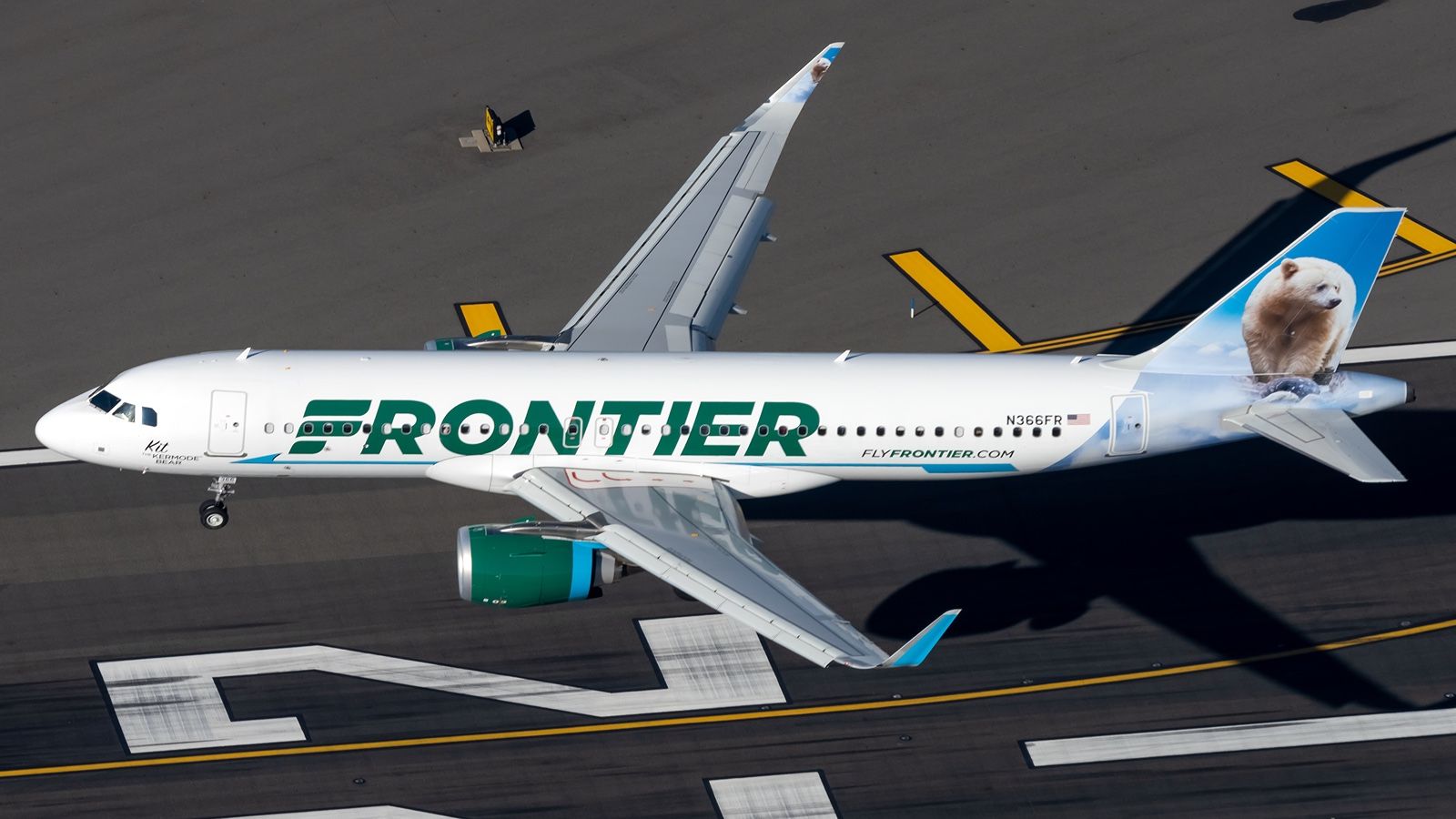
When thinking of Frontier, one might immediately link it to the diverse tail liveries that the airline has. Frontier paints each of its aircraft with a species of animal and has been doing so since its founding. The collection consists of many endangered species and various land, sea, and sky animals.
On the other hand, the official Frontier logo is painted on the fuselage of its jets, as seen below. The letter F, which also serves as the icon of the business, consists of three stripes of different lengths. The logo is reminiscent of a bird’s wing and was based on a design from 1978 by Saul Bass.

Photo: Andrew Mauro | Shutterstock

Related
Here’s Why Frontier Airlines Paints Animals On Its Aircraft Tails
Animals have been adorning the tails of Frontier Airlines’ aircraft for almost 30 years – where did the idea originate from?
The ‘old’ Frontier
Frontier Airlines originally started operations in 1950 after the merger of several carriers, including Arizona Airways and Monarch Airlines. It took to the sky with DC3s, and its logo featured a flying arrow with half-segments, with ‘Frontier Airlines’ written in italic lettering in flat capital letters.
Photo: Logo-world
A new logo was introduced in 1978, which bears a similar design to the current one. It was designed by Saul Bass, who stylized “F” in the form of a bird’s wing and illustrated it in the form of white horizontal stripes of different lengths located in a red circle. The logo was used until 1986, when the airline went out of business.
1990s
Photo: logos-world
The ‘new’ Frontier Airlines came to life in 1994, using the same name but unrelated to the older airlines. A new logo with a completely different style was used to establish the new brand. The word Frontiers used italic styling at an uneven height, while the word airlines was written in a wide-spaced classic font.
2000s
Photo: logos-world
Heading into the 21st century, Frontier changed its logo and embraced simplicity. The handwritten style was changed to a large, bold printed font with a color scheme similar to the current logo. This redesign made the logo more legible for its customers.

Photo: Shutterstock | EQRoy
2010s

Photo: Frontier Airlines
At the end of 2013, the airline was acquired by Indigo Partners, a private equity group that also owns JetSmart and a stake in Volaris and Wizz Air, among other aviation businesses. The new owners changed the business strategy and, with that, the brand identity. A new livery and logo were ordered from PS: Studios, Inc. The designers gave the Saul Bass emblem a second life to highlight the brand’s history, utilizing the original wing to replace the letter ‘F.’

Related
Frontier Airlines Announces Massive Expansion At 38 Airports
These new services are set to begin in April, May, or June.