Summary
- The rebrand includes color changes and adjustments to the logotype.
- The logo colors have been darkened with a new unified design.
- Fleet renewal is well underway with the first A220 due for delivery next month.
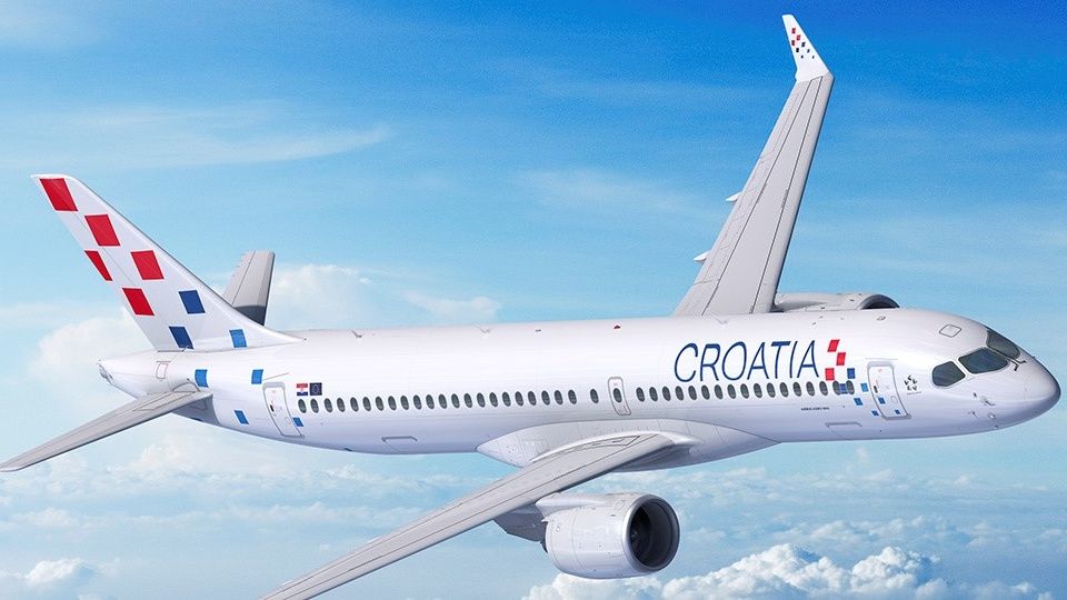
Croatia Airlines has unveiled a refreshed visual identity as it gears up to take delivery of its first Airbus A220 next month. The carrier’s new paint scheme features similar colors, with some minor changes to the text displayed on its aircraft and, more importantly, to its logo.
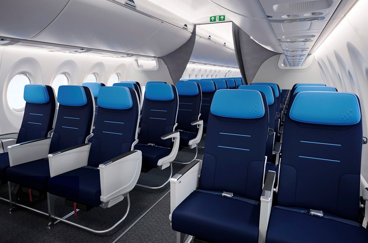
Complementing the adjustments are refreshed interior designs, which will likely first be featured on the carrier’s new A220s. The carrier says the latest changes convey its “strategy, values, and commitment to excellence.”
Changes to colors and new A220 interiors
Croatia Airlines’ new identity was developed by company designer Ivana Ivanković, who attempted to simplify the brand while ensuring its modernization.
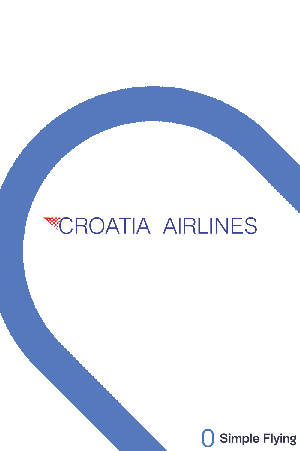
One of the more noticeable changes is the logo. The iconic red, blue, and light blue squares that adorn the tail fin and merge into the fuselage will now also be adopted as the carrier’s logo. They have also been readjusted into a darker shade. Prior to that, a red dotted pattern was used, attached to the C of Croatia Airlines.
This was seen on the airline’s aircraft, featuring near the front of the fuselage. In other words, the latest update means that Croatia Airlines will repeat the tail design twice, simplifying its visual identity. The carrier said:
The logo design seamlessly integrates with the aircraft tail design, a signature feature of the company.
A revised logotype
Another interesting aspect of the livery is its similarity with the Star Alliance logotype.
Crucially, the logo and logotype are artistically aligned with the Star Alliance logotype through a contemporary design, where the squares on the logo resemble the aircraft tail, effectively conveying the intended message.
Photo: Croatia Airlines
Croatia Airlines has also revamped the typography of its name within its logo, emboldening the writing and ensuring its visibility.
Specifically, the logotype features letters that are slightly bolder, maintaining its original character, and the colour has been adjusted to a darker shade.
Finally, the Zagreb-based airline announced its plans to unveil new cabin crew uniforms shortly but did not specify when.
Fleet renewal with the A220
The new identity comes as the carrier celebrates its 35th anniversary. It began operations in August 1989 with a Cessna 402 C carrying UPS packages. The anniversary also coincides with the delivery airline’s first A220, unveiled from the Airbus paint shop just a few days ago.
The introduction of the new fleet will mark the beginning of a new era of our operations, defined by a fresh visual identity that has been carefully crafted and optimised.
Croatia Airlines plans to take 15 Airbus A220 aircraft, comprising both the -100 and bigger -300. According to EX-YU Aviation, the airline has 12 of the larger members of the A220 family on order and three -100s.

Related
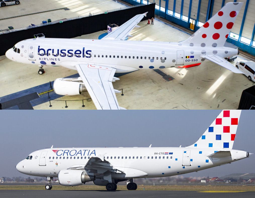
What Croatia Airlines Thinks Of Brussels Airlines’ Similar Livery
The first A220-300 registered 9A-CAE, is expected next month and will feature the new livery. It will be inaugurated on the symbolic Zagreb to Frankfurt route, a reference to carrier’s first international flight in 1992.
What do you think of the new brand identity? Let us know in the comments below.


