Hawaiian Airlines
is the oldest airline in Hawai’i and one of the oldest in the US. The airline was founded on January 30, 1929, as Inter-Island Airways in Honolulu. When the carrier launched operations, it used Sikorsky S-38 amphibian planes that carried eight passengers.
Fast-forward to 2024, and Hawaiian Airlines still holds true to its roots, serving as a crucial mode of transport for those hopping between islands in the state of Hawai’i. But beyond that, it has grown its fleet to more than 60 aircraft, and its route network has more than 30 destinations. Most recently, the airline was acquired by Alaska Airlines, and together, the two airlines now have a route network that includes more than 140 destinations.
When the two airlines announced the deal, Alaska said it would keep the Hawaiian brand alive. Even after the merger’s approval, Alaska has maintained this position.
Related
Deal Complete: Will Alaska Airlines Keep Its Promise To Preserve Hawaiian Airlines Brand?
Over several occasions, Alaska Airlines has promised to keep the Hawaiian Airlines brand.
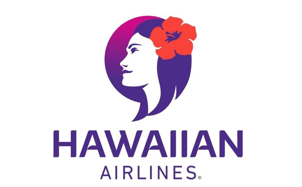
Who is the face behind the logo?
According to 1000 logos, the airline’s logo has changed ten times since its founding in 1929. The first time a woman appeared on the logo was in 1973; this woman has been the focal point of the logo since then. Many believe the logo was inspired by Leina’ala Ann Teruya Drummond, a former Hawaiian Airlines employee.
Drummond became well-known for being named Miss Hawaii in 1964 and ranking in the top ten at the Miss America Pageant that year. At the time, she was 18 and worked as a flight attendant. The Pualani logo, as Hawaiian Airlines calls it, which features a woman, was first introduced in 1973.
In September 2023, Drummond passed away at 77 years of age. When she passed, the Miss Hawaii Organization shared the following on social media,
“The stunning beauty from Wailuku, who performed a monologue, placed in the top 10 at Miss America and is forever recognized as the inspiration behind the iconic Hawaiian Airlines face which symbolizes aloha worldwide. Rest in love and aloha — your light shines brightly for the rest of the world to see. Our prayers and thoughts are with her ohana during this challenging time.”
Pualani means “flower of the sky,” and the carrier says it has been a beacon of Hawaiian hospitality. Though many claim that Drummond was the inspiration for the logo, the airline said,
“Contrary to popular belief, she was not modeled after any of the Miss Hawai‘i winners. Her strong presence and features were conceptualized as a real-life representation of our company’s mission and aloha for the Islands.”
The evolution of the Pualani logo
The change to the Pualani logo in 1973 was a major change for Hawaiian. The new logo and branding were created with Landor Associates, a design house that is famous in the aviation world. Landor created the famous “Landor Livery” that was flown on British Airways’ planes from 1984 to 1997.
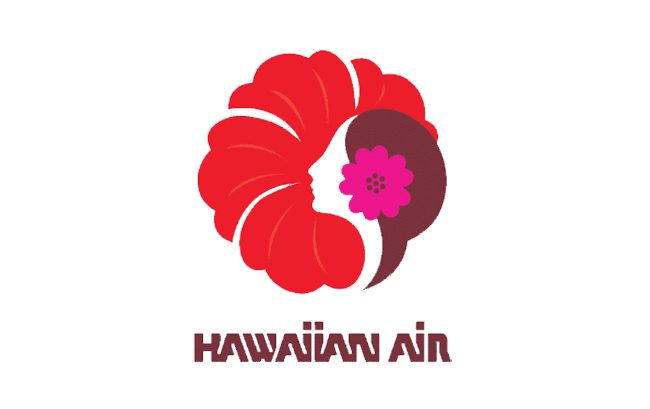
The Pualani branding features a young Hawaiian woman with a flower in her hair and a larger flower behind her. As mentioned above, this is a tribute to the airline’s service and the islands’ tropical style. When the first logo was introduced, the woman’s head formed the larger flower, and the words ‘Hawaiian Air’ were written in a block-style font underneath the logo.
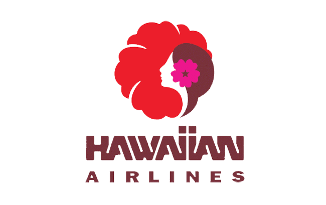
Seventeen years ago, the original logo was changed, and some of the changes were extremely subtle. In the first variation, there were thin white lines at the top of the flower that were eventually removed. In the second version, the airline name under the logo was changed to ‘Hawaiian Airlines’, with the word ‘Hawaiian’ sitting above the word ‘Airlines’ in a larger and different font.
Related
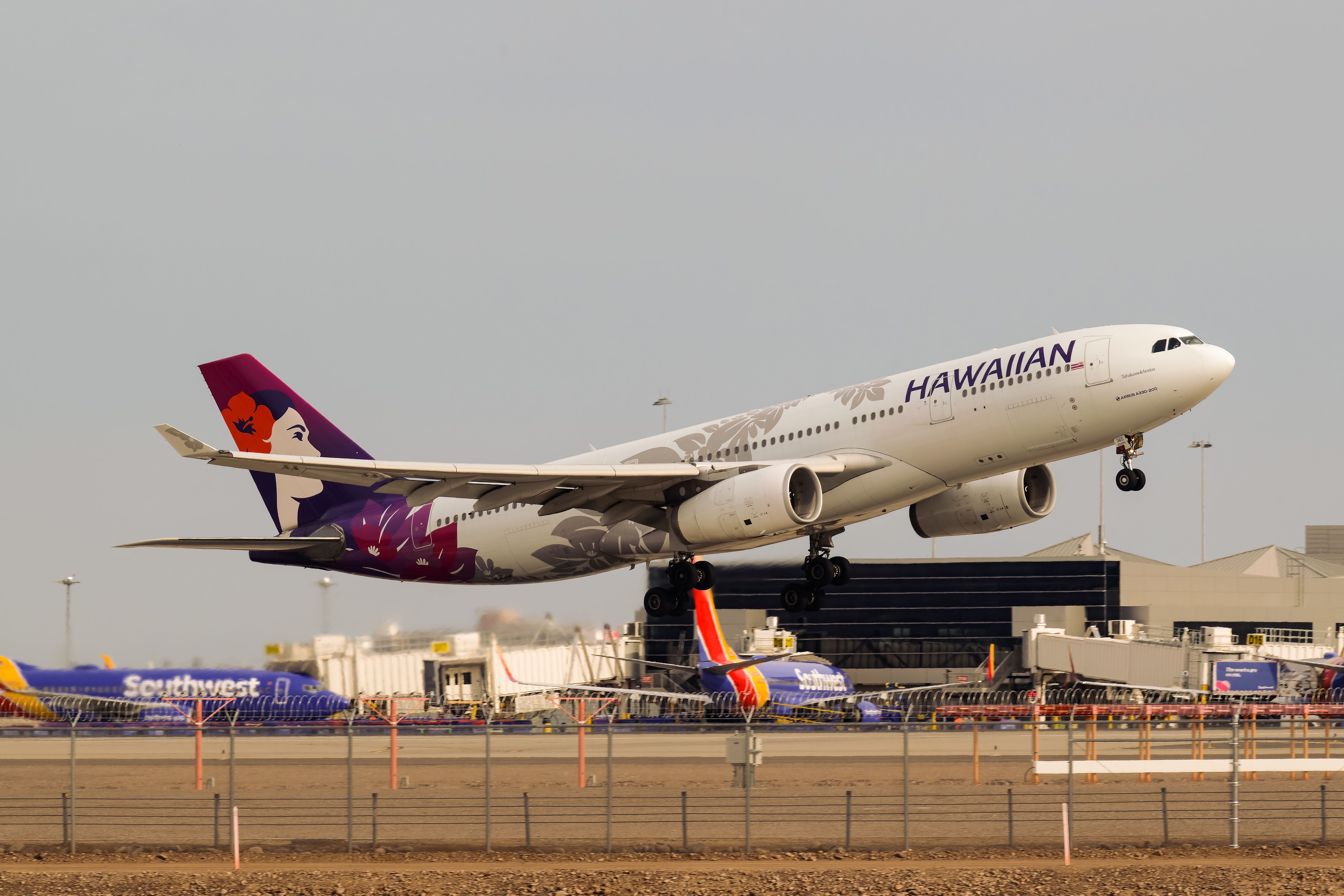
Hawaiian Airlines To End Direct Austin-Honolulu Flights In March 2025
The airline operates this route with an Airbus A330-200 aircraft.
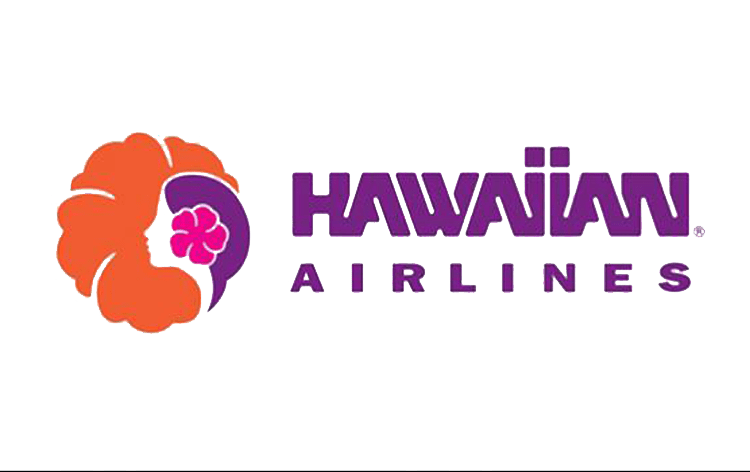
A short five years later, Hawaiian modified the logo once again. This time, color changes were also made. The flower was changed to an orange color and the letters were changed to purple.
There were a few points of continuity from the previous logo. The flower remained the same design, and the lady’s hair color and the font color of the airline’s name matched. In the previous logo, the hair color and font were brown, but the new version shifted to purple. In addition to changing the color, the airline decided to place the flower next to its name.
The third logo only lasted five years, and in 2001, Hawaiian changed it again. This variation was the longest one used by the airline. The logo introduced in 2001 was completely modernized, with changes to the woman and the font with the logo.
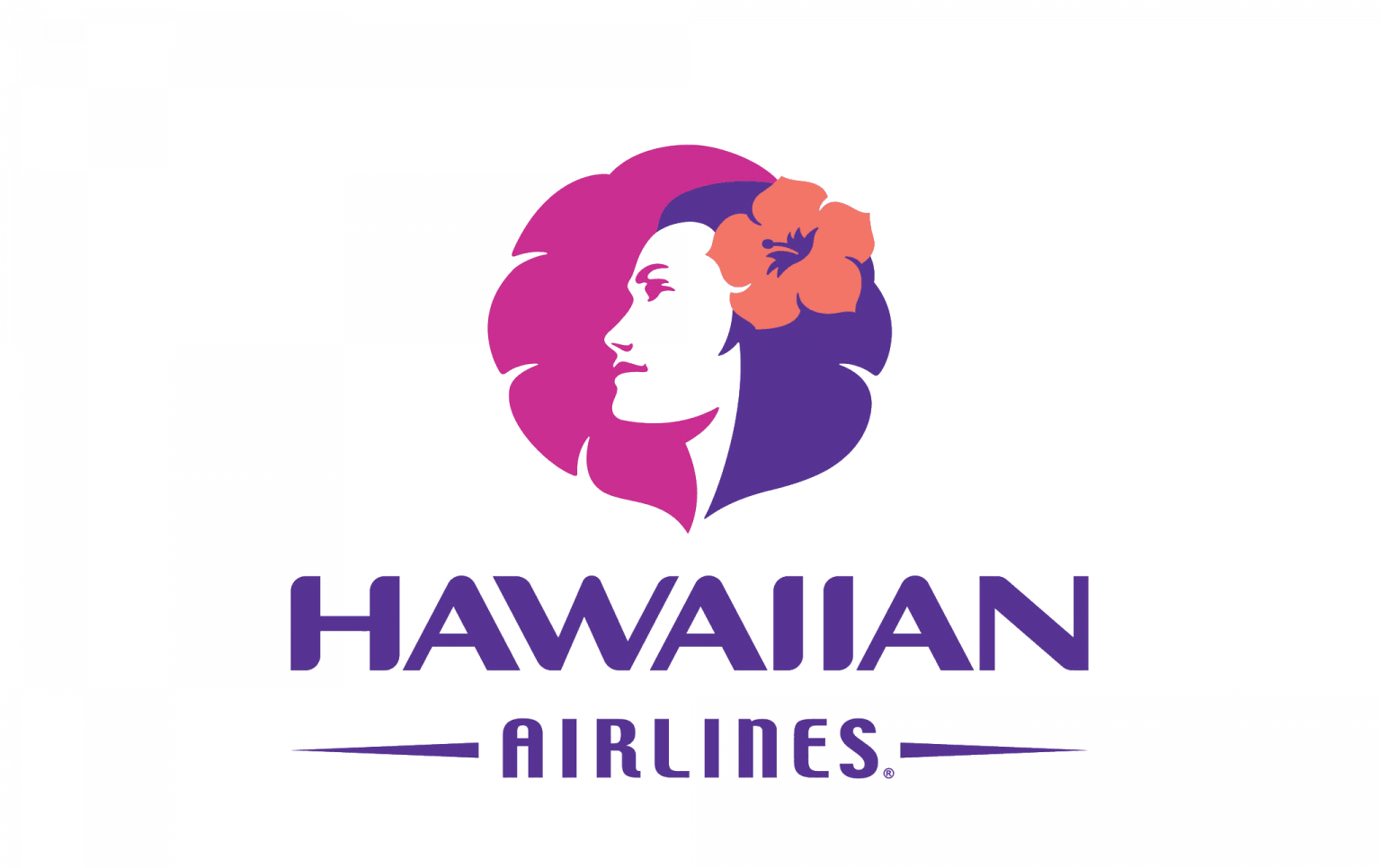
In this version, the woman had more details added, featuring a face for the first time. Her hair remained purple, the same color as the font, and was used as part of the flower, blending in more than before. The flower in her hair also became brighter and bigger. 2001 marked the first time since the airline’s founding that the font in the logo was changed. Hawaiian chose to keep the font purple but once again moved the woman above the letters. The word ‘Hawaiian’ continued to be bigger and the word ‘Airlines’ was placed underneath.
In 2017, Hawaiian made its most recent change. This time, the flower around the woman’s head went away and what remained behind her head is simply part of a circle and is only visible on the left side of the logo. The font was once again changed and the lines on either side of the word ‘Airlines’ were removed.


