Colors, patterns, and logos, among others, are carefully designed and decided to create an impression that lingers around in the customer’s mind even when they’re not around the product. Even those who don’t much care about the aircraft or the airline they’re flying with are likely to subconsciously register the various visual representations of the company, which might unknowingly influence their ticket purchase the next time.
Before the ‘Tulip’
Over the years, we’ve come to love or have become familiar with popular aircraft liveries and logos, and among the most iconic logos has been that of the legacy carrier ![]() United Airlines
United Airlines
. While many young people today recognize the airline with its globe design on the tail, many folks of a certain vintage grew up watching United Airlines fly with a logo that became known as the ‘Tulip.’
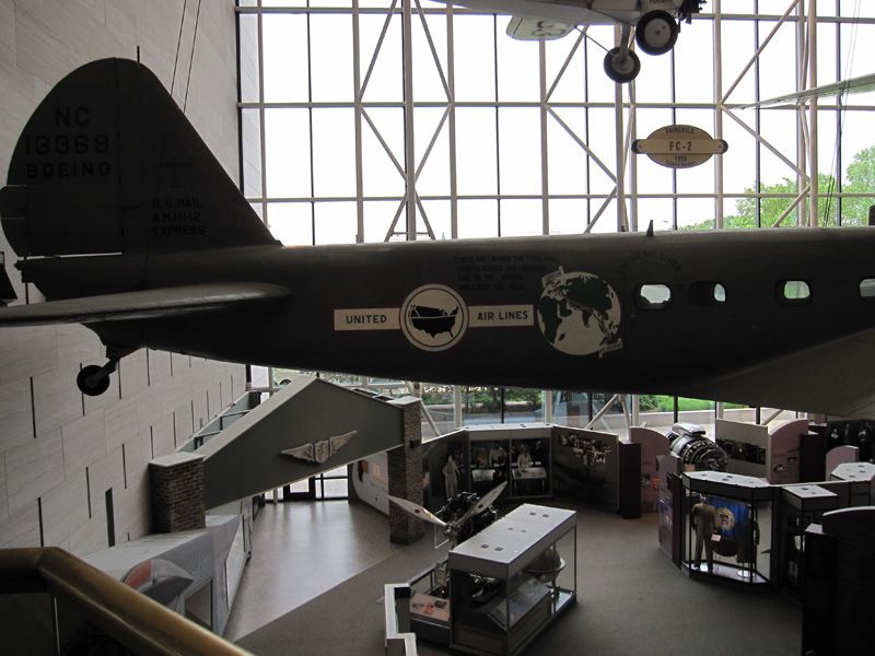
But even before that, United had several other early logos in its first few decades of business. In its early days, the carrier had a silhouetted map of the United States as its logo before it settled for a more permanent shield design.
The shield also underwent various tweaks over the years. The earliest versions included a silhouette of the United States at the bottom, which was later dropped in favor of a more simplified design with just the airline’s name and red and blue colors.
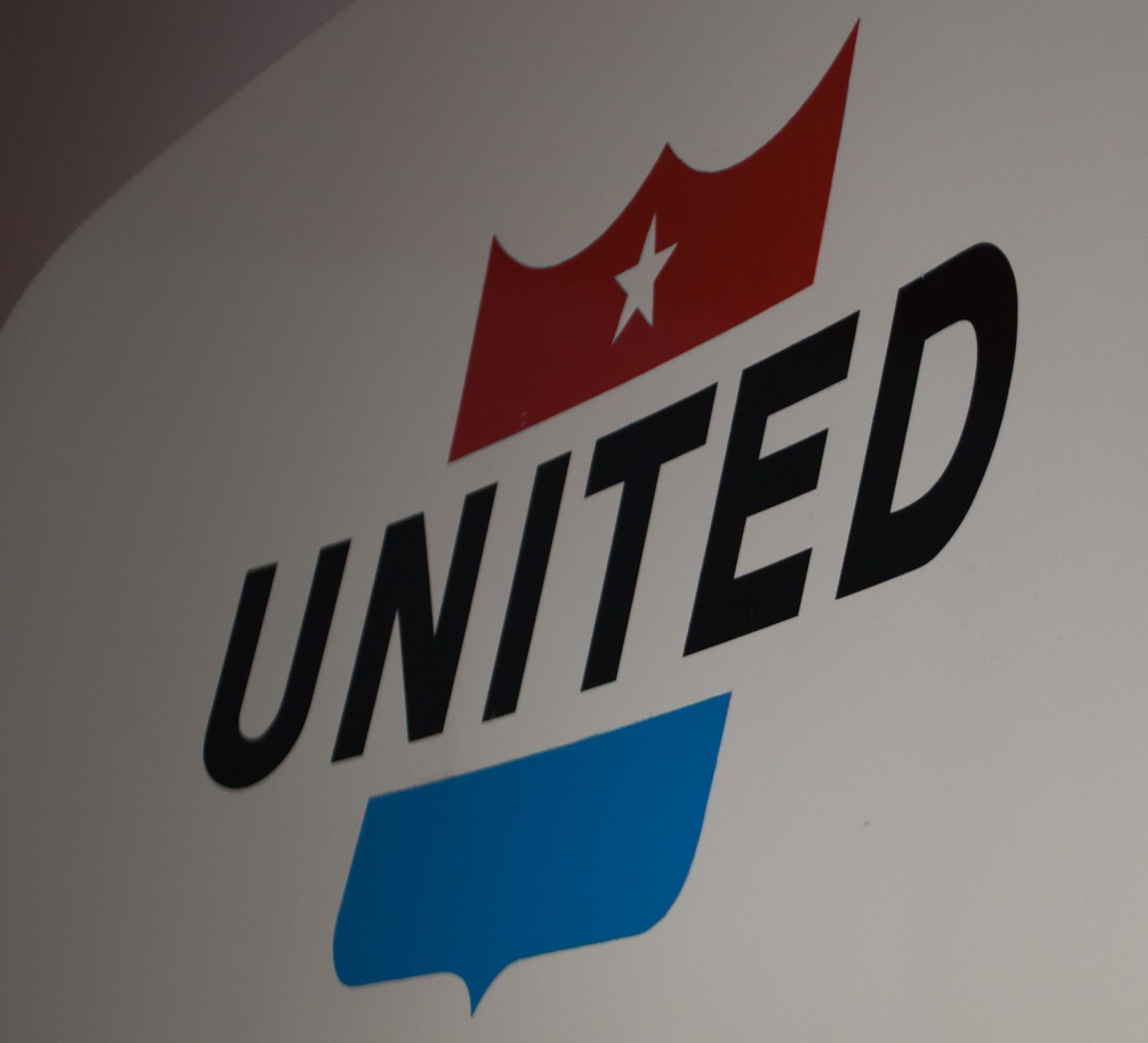
After minor changes to the shield, the airline again made a significant brand shift and introduced the ‘spike’ logo. The United name was featured in blue and black, and an oblique vertical spike ran through the word and colored in blue at the bottom and red at the top.
In some of the earlier decades, United operated with a not-so-consistent brand identity as various versions of shields and spikes appeared. Even the aircraft livery was modified in the 1960s with a red line on the lower fuselage, popularly known as the “Friend Ship” livery.
It’s not uncommon for airlines to occasionally repaint some of their planes with vintage liveries to bring back memories of the past decades, usually coinciding with important anniversaries or to mark other significant occasions. United, too, brought back the Friend Ship livery on its aircraft for its 85th anniversary celebrations.
The iconic ‘Tulip’ logo
By the 1970s, United had established itself as one of the leading airlines in the country. With significant growth projected after a few tumultuous years, it felt that it was the right time for another major rebranding exercise.
This was when graphic designer and Academy Award winner Saul Bass was chosen to design United Airline’s next logo. Bass had extensive experience designing title sequences for motion pictures, logos for big corporations, and film posters.
United approached his Los Angeles-based design company, Bass and Associates, where the company’s needs were discussed to design a new brand strategy that would appeal to their targeted demographic.
According to Logo Histories, they worked for two years, during which much research was done, and public opinion was also sought about the airline. Many logos, typographic styles, and colorways were tested in the process.
The shield logo had been with the airline for many years, but it was also a symbol of other organizations and governmental enterprises of the time. As such, United wanted to step away from that logo and was searching for a new, unique brand identity to set it apart.
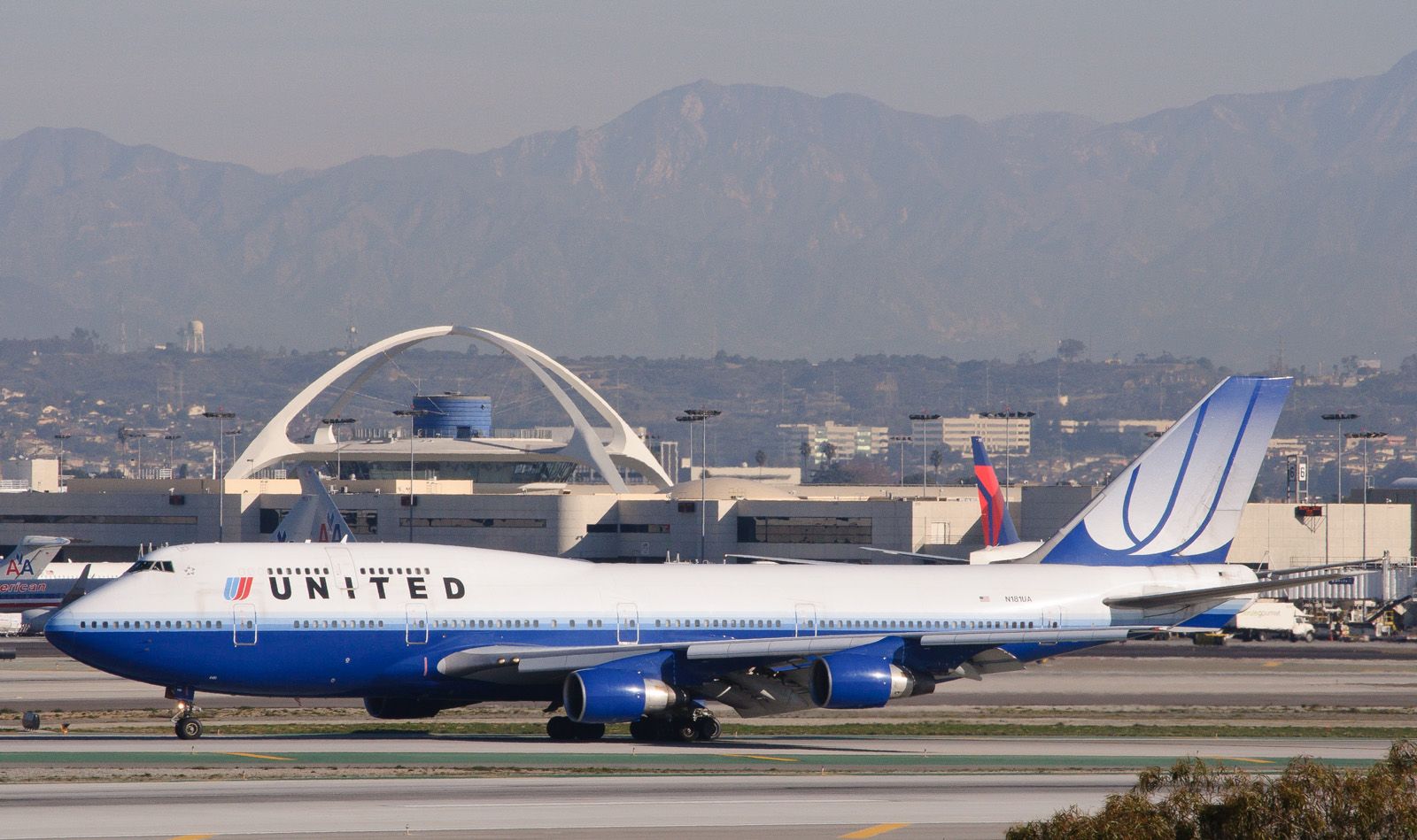
Finally, in 1974, United received its new logo, which would remain with it for the next several decades. It comprised two overlapping U-shapes slanted at a 68-degree angle and featured the colors of the country’s national flag—red, blue, and white. The shape of the new logo earned it the moniker ‘Tulip.’
Of course, the aircraft’s livery also had significant changes. Vibrant orange, red, and blue stripes were painted on the fuselage as a cheatline passing through the windowline. Cheatlines were a popular paint scheme trend in aviation back in the day.
Many airlines had cheatlines back then, made up of either single or multiple strips. Another famous livery with cheatlines was that of American Airlines. Many believed that these lines gave the aircraft a more streamlined look, and as they passed through the window line, it felt that they blended with the fuselage much better than without the line.
With the new branding, colors, and logo, the carrier also got its full name back – United Airlines. Logo Histories adds that United distanced itself from the decorative serif of the old wordmark and got “a modern square-like sans-serif in all-caps for the airline’s titles.”
Indeed, this was perhaps the first time in United’s history that it consistently stayed with a logo and identity without making any significant changes for decades. The Tulip became one of the most recognizable logos of that era and appeared on hundreds of United’s items, including all ground equipment, planes, ticket books, and stationery.
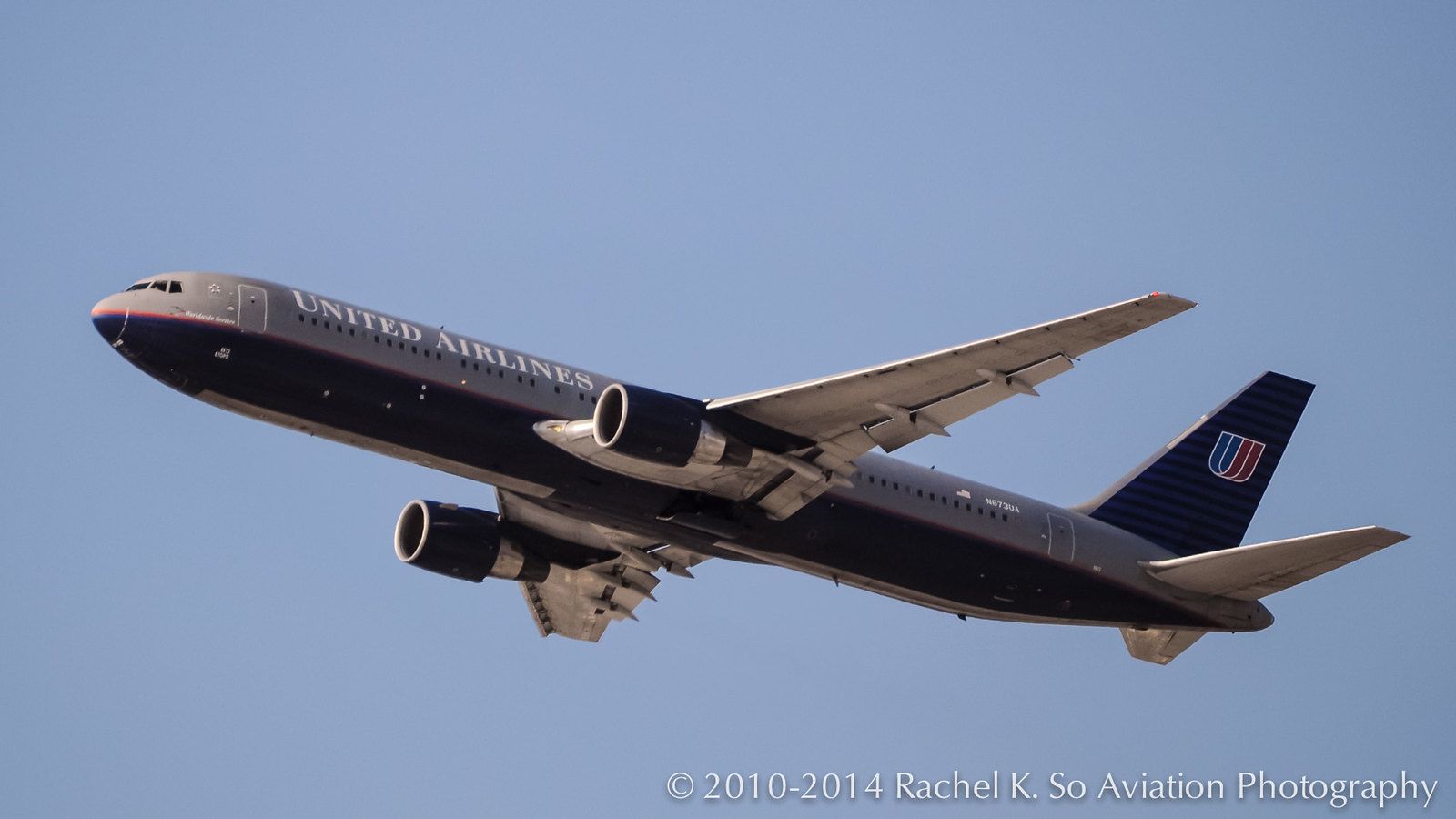
In 1993, United again undertook a rebranding exercise, opting for a dark blue and gray fuselage called the ‘Battleship’ livery. The tulip design was retained, but its size was reduced slightly.
Towards the end of the 1990s, the carrier further tweaked its branding and returned to just United, changing the font to Bodoni and Helvetica. The Tulip evolved again, this time larger and cropped, and it was called the “Rising Blue” or “Blue Tulip” livery. This only began showing on the carrier’s planes in 2004. This rebranding was done by the British design company Pentagram, which said,
“We proposed to begin this rejuvenation by putting two elements at the center of its graphic program. The first was the United name, which we thought—and still think—is the best in the business: simple, confident, and expressive of so much about the world of air travel. The second was the symbol, which we decided to not merely keep, but to celebrate.”
Merger with Continental and a new logo
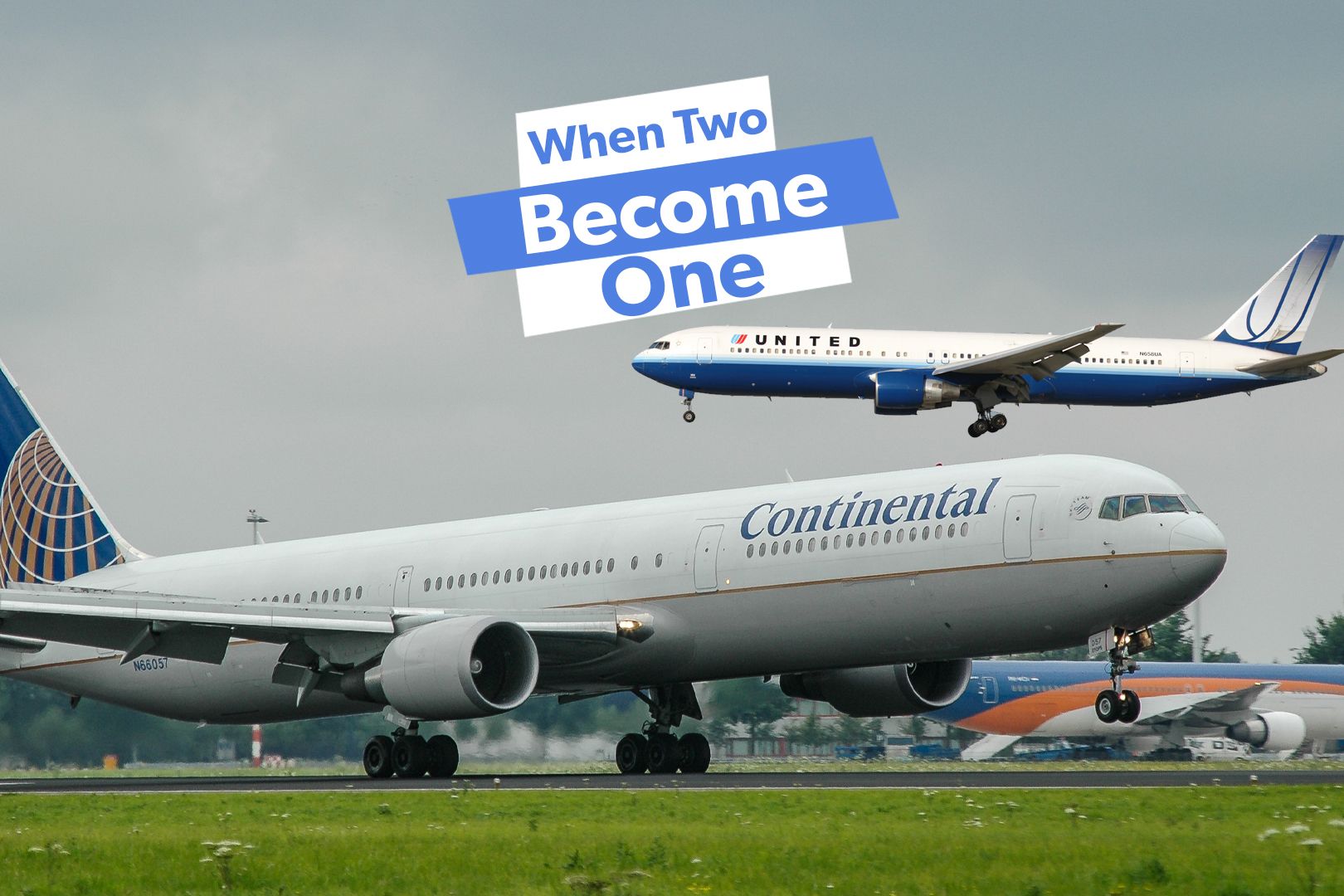
In the early 2000s, several airline mergers and acquisitions occurred, and Continental Airlines and United Airlines also started considering a merger. Continental Airlines had a significant presence in the south and east, while United Airlines had a substantial presence in the west, and as such, both carriers’ routes complemented each other.
Related
History: Why Did Continental & United Airlines Agree To Merge?
The merger was a way to grow the airlines’ networks and save money.
When the two airlines’ shareholders voted for the merger in 2010, United became the world’s largest airline at the time. Of course, as usually happens during such deals, elements of both airlines are borrowed into the new entity. The new airline was called United Airlines, while the logo was borrowed from Continental.
After years of having the Tulip on aircraft tails, United swapped the iconic logo with Continental’s globe. United Airlines CEO at the time, Oscar Munoz, commented,
“As we improve and elevate our customer experience, we are changing the way people think and feel about United, and this branding captures that new spirit… This modernized design, especially our iconic globe, enhances the very best of United’s image and values while pointing in the direction of where we intend to go next in serving our customers.”
Not the only airline
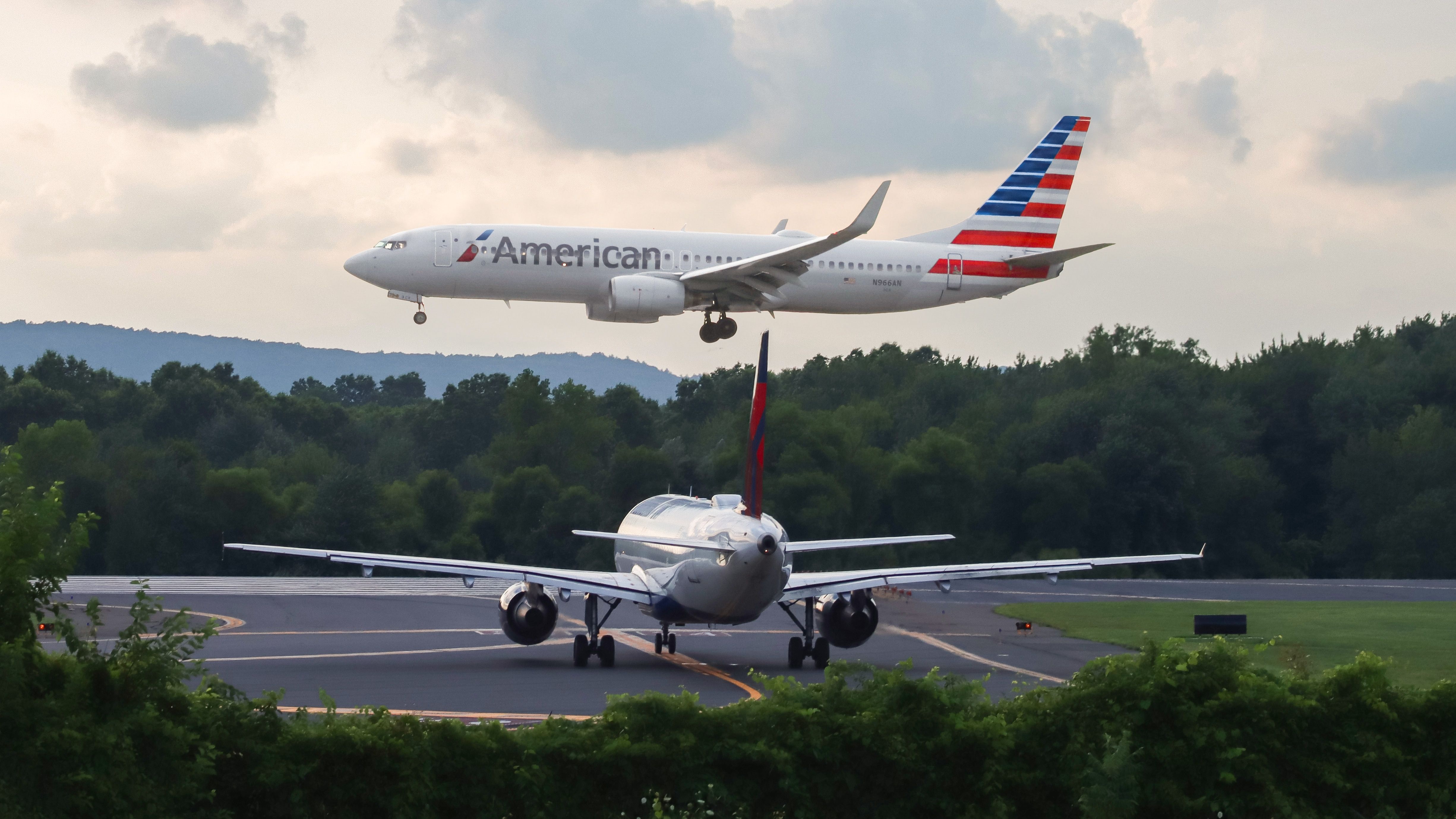
Over the years, several other global airlines have had their logos changed or tweaked. American Airlines has also evolved its logos over the decades. The most prominent one in living memory was that of an eagle between two As, which was replaced in 2013. It features a flight symbol and rolled sleeves of red color subtly hinting towards a white bird.
Photo: BravoKiloPhoto | Shutterstock
In 2023, Emirates revealed a new livery, with the signature gold “Emirates” lettering across the main body in English and Arabic becoming much bolder. The UAE flag on the Emirates tailfin was much more dynamic and flowing with a 3D effect artwork. The wingtips were also painted red with the Emirates logo in Arabic calligraphy “popping” out in reverse white.
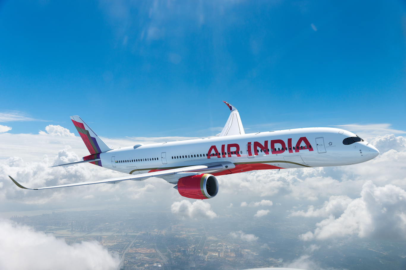
The same year, Air India also underwent a massive rebranding and
unveiled its new colors
: deep red, aubergine, and gold. The writing featured a new ‘Air India Sans’ font, with the edge of the window designs transformed into ‘The Vista’ logo – a mix of old and new, retaining the color palette but modernizing the looks.
Photo: Air India
The tail of the aircraft featured a mixture of the golden window edge, iconic red, and purple from Vistara and the carrier’s CEO, Campbell Wilson, said,
“Our transformative new brand reflects an ambition to make Air India a world class airline serving guests from around the globe, and that represents a new India proudly on the global stage. The new Air India is bold, confident, and vibrant, but also warm and deeply rooted to its rich history and traditions that make Indian hospitality a global benchmark for standards in service.”

