
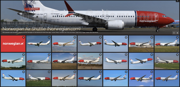
Norwegian is modernizing its visual profile and logo for the first time since its establishment in 2002.
- Norwegian’s logotype and brand are both well-known and appreciated, which we are very proud of. Even if we innovate, we promise that customers will recognize us. After over 20 years, it is time for a modernization and the new profile will give Norwegian a more modern, warmer and clearer expression, says Kristoffer Sundby, Norwegian’s Group Director for Market and Customer Service.
Norwegian has had the same logotype since its inception in 2002 and it is a well-established and strong brand. Behind the change is partly a need to adapt the visual profile to today’s demands and needs for marketing, but also a desire to more clearly show the personality and character of the company and the brand. The upgrade is part of the company’s 20th anniversary in 2022 and with the aim of becoming Europe’s most popular and reliable airline.
- The new visual identity has a richer color palette, a new typographic expression and image style, as well as a more flexible layout system. We look forward to showing off the new profile, both internally and externally. The phasing in of the new profile will take place gradually. We start with digital channels and then update gradually and structured in all marketplaces, offices, airports and on the planes themselves. The old and new profile can live side by side during a transition period. At the beginning of March, the new profile and logo will be seen for the first time in own and external media, says Camilla Aspen, creative director at Norwegian.
Norwegian aircraft photo gallery:
